
Hallway Wall-Printing Ideas for Narrow and Open Circulation Spaces
Hallway wall printing ideas for narrow corridors and open circulation spaces in Saudi homes: layouts, doors, calligraphy, colour and planning steps.
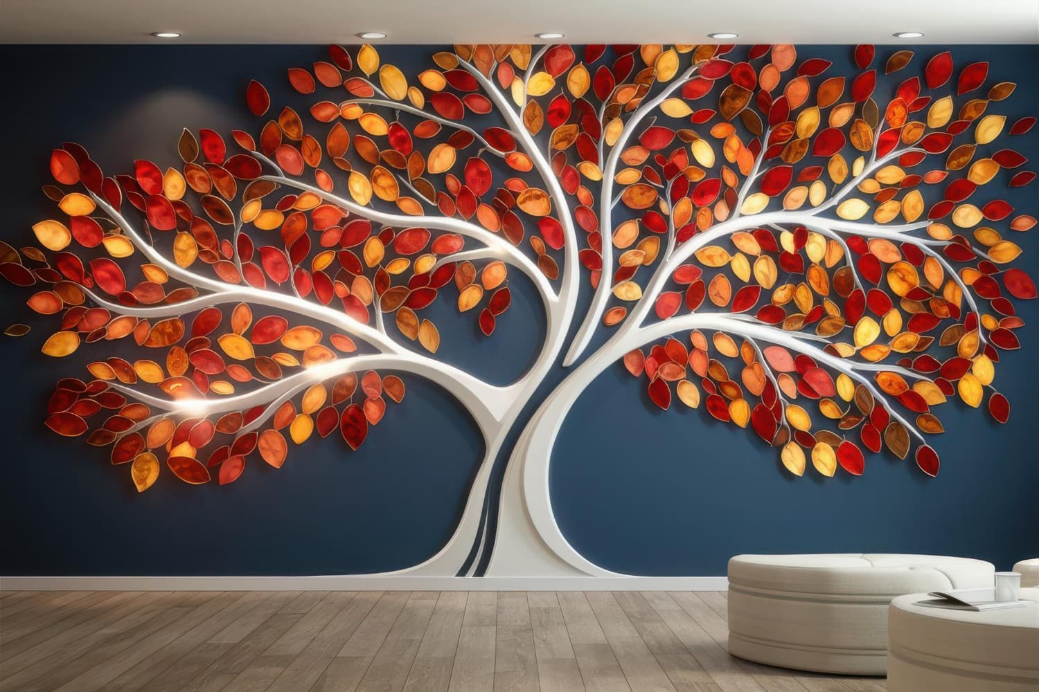
The best hallway wall printing ideas work with movement, not against it. In a narrow corridor, use long horizontal compositions, soft colour and low visual noise so the space feels wider. In an open circulation space, a single focal panel at the end of a sightline works better. Measure doors and switches first, then design around them.
Why Hallways Need a Different Wall-Printing Approach
A hallway is not a room where people sit and look at a wall. It is a route. Family members and guests move through it, usually quickly, often while carrying something, and they see the walls at an angle rather than straight on. That changes how artwork is read. A detailed scene that looks impressive in a living room can feel cluttered in a corridor because nobody stands far enough back to take it in.
Three conditions make hallways different from other walls in a home:
- Short viewing distance. In a narrow corridor the opposite wall may be close to your shoulder, so the artwork is seen from very near and in pieces.
- Walking direction. People read the wall from one end to the other, so a composition can be planned like a sequence, with a beginning, a middle and an end.
- Door rhythm. Bedroom doors, bathroom doors, cupboards, switches and thermostats break the wall into segments. Good hallway designs treat these breaks as part of the layout.
Once you design for these conditions rather than for a flat rectangle, the options become much clearer.
Hallway Wall Printing Ideas for Narrow Corridors
Narrow corridors are common in apartments and in the private wings of villas in Riyadh and Jeddah. The goal is usually to make the passage feel calmer and wider, not busier.
Run the composition horizontally
Interior designers often recommend horizontal lines in narrow halls because they lead the eye along the length of the wall rather than across a tight width. A printed horizon, a soft landscape band, a slow wave pattern or a line of Arabic calligraphy set at eye level all follow this principle. Keep the band continuous where possible so the corridor reads as one surface rather than a series of interrupted panels.
Choose a restrained palette
Light, low-contrast colours keep a narrow passage open. Two or three tones drawn from the floor, doors and adjoining rooms usually work better than a full-colour scene. If the corridor gets little daylight, avoid very dark backgrounds that absorb what light there is.
Use scale carefully
Large, simple shapes read better at close range than many small details. A single botanical stem, a sweeping line or an abstract gradient can carry a whole corridor. Fine detail is wasted when viewers pass within arm's reach.
Keep the lower zone practical
The bottom part of a hallway wall takes the most knocks from bags, cleaning equipment and children. Many homeowners keep the busiest part of the design above hip height and let the lower section stay plain or use a quieter continuation of the pattern.
Ideas for Open Circulation Spaces and Long Galleries
Wider circulation areas, such as gallery landings, the spine corridor of a villa or the passage that links a majlis to the family area, give you more freedom. Here the risk is the opposite: a long, empty wall can feel like a waiting area.
Create a focal point at the end of the sightline
A long hallway can be visually shortened by placing the strongest image at the far end, where people see it straight on as they approach. A printed archway, a framed landscape or a large calligraphy panel on the end wall gives the walk a destination.
Tell a story in panels
Because people walk the route in one direction, an open corridor suits a sequence: a desert scene that moves from dawn to dusk, a family heritage timeline or a series of architectural motifs from different Saudi regions. Each segment between doors becomes a chapter.
Connect to the rooms on either side
Hallways sit between spaces that already have their own colours and materials. Borrowing a tone or motif from the majlis on one side and the bedroom wing on the other makes the corridor feel like part of the home's design rather than an afterthought.
Narrow Corridor vs Open Circulation Space: Quick Comparison
- Main goal: a narrow corridor should feel calmer and wider; an open circulation space should give the walk a destination.
- Composition: a continuous horizontal band for narrow corridors; an end-wall focal panel or story sequence for open spaces.
- Detail level: large, simple shapes in narrow corridors; more detail is possible at the focal wall of an open space.
- Palette: two or three light, low-contrast tones in narrow corridors; stronger contrast and colour can work in open spaces.
- Typography: short, restrained or none in narrow corridors; larger calligraphy or quotations can work in open spaces.
How Do Doors, Switches and Corners Affect the Design?
Doors are the biggest constraint in most hallways. Before any artwork is chosen, the wall should be measured as a series of segments: door frames, architraves, switches, sockets, thermostats, access panels and any skirting. These elements decide where an image can run and where it must stop.
A few practical rules help:
- Avoid placing a face, a key word or the focal point of an image where a door frame or switch will cut through it.
- Where a pattern continues across several door openings, align it to a consistent height so the eye can connect the pieces.
- If the hallway turns a corner, split the design into separate panels instead of forcing one image to wrap around and distort.
- Check whether doors swing into the corridor; an open door can hide part of the wall for most of the day.
We cover the detail of this process in our guide on planning wall printing around windows, doors and switches, which applies directly to busy corridors.
Using Typography and Calligraphy in Hallways
Words are popular in Saudi homes, especially Quranic verses, family names, poetry and words of welcome near the entrance. In a hallway, typography needs extra care because people read it while moving and often from an angle.
- Keep it short. One line or one phrase is easier to read in passing than a paragraph.
- Place it where people pause. The end wall, the area beside the main entrance or the landing at the top of a stair is better than the middle of a long side wall.
- Respect the content. For religious text, consider placement carefully, for example avoiding positions next to bathroom doors, and confirm the exact wording and spelling with the family before approval.
- Match the script to the home. Traditional Thuluth or Diwani suits a classic interior; a clean modern Kufic can suit a contemporary villa.
Planning a Hallway Wall-Printing Project Step by Step
A simple sequence avoids most surprises:
- Photograph the full corridor from both ends and take straight-on photos of each wall segment.
- Measure every segment between doors and corners, plus the heights of switches and frames.
- Note the light: daylight from windows at the ends, ceiling spotlights or wall lights that may cause glare on certain finishes.
- Decide the role of the hallway: calm passage, story sequence or focal end wall.
- Prepare or choose artwork at a resolution suitable for the final size; our checklist on artwork file requirements for large-format wall printing explains what to check.
- Review a design mockup placed on the real wall photos, with doors and switches marked, before giving written approval.
- Plan installation timing so the corridor can be kept clear while work is in progress, since it is often the only route between rooms.
If your corridor connects to a stairwell, the same planning applies to angled and double-height walls; see our guide to checking staircase wall printing feasibility before choosing a design.
Common Mistakes to Avoid in Hallway Designs
- Choosing artwork from a phone screen. An image that looks good small can feel overwhelming at full corridor scale. Always review a mockup at the real proportions.
- Ignoring the opposite wall. In a narrow passage you can see both walls at once. If both carry strong designs, they compete.
- Too many ideas in one space. A hallway that tries to combine a landscape, a quotation and a pattern usually ends up busy. Pick one idea and repeat it.
- Forgetting maintenance. Corridors get touched often. Ask about suitable finishes and cleaning guidance for high-traffic walls before you approve the design.
- Skipping the site check. Damp patches, cracks or uneven plaster are easier to fix before printing than after.
Frequently Asked Questions
What is the best wall-printing design for a narrow hallway?
A continuous horizontal composition in two or three light, low-contrast tones usually works best. It leads the eye along the corridor instead of across it, which helps the space feel wider. Large, simple shapes read better at close range than fine detail, and keeping the busiest area above hip height protects it from everyday knocks.
Can wall printing make a hallway look bigger?
Printing cannot change the real dimensions, but it can change how the space feels. Horizontal bands, soft gradients, landscape horizons and light backgrounds tend to open up a narrow corridor visually. Very dark, busy or high-contrast designs usually do the opposite. A mockup on photos of your actual hallway is the most reliable way to judge the effect before approval.
Should I print on one hallway wall or both?
In most narrow corridors one printed wall is enough, with the opposite wall kept plain or in a matching solid colour. Printing both walls can feel enclosing because you see them together. In wider galleries, both sides can work if they share one palette and theme, or if one side carries the main design and the other a quieter echo.
Is calligraphy suitable for a hallway wall?
Yes, if it is short and placed where people naturally pause, such as the end wall, the entrance area or a stair landing. Long text is hard to read while walking. For religious verses, choose a respectful location away from bathroom doors and confirm the exact wording, spelling and script with the family before approving the final design.
What should I send to get a hallway wall-printing quote?
Send photos of the corridor from both ends, straight-on photos of each wall segment, measurements between doors and corners, the city and type of property, and your design idea or reference images. Mention any switches, panels, damp or cracks. This information lets the team assess feasibility, suggest a layout and prepare an accurate quotation for your project.
Conclusion
Successful hallway wall printing starts with how people move, not with a picture. Narrow corridors benefit from calm, horizontal, low-contrast designs that make the passage feel wider. Open circulation spaces suit an end-wall focal point or a story told in panels. In both cases, map doors, switches and corners first, keep typography short and review a mockup on real photos before approving.
Planning a printed hallway, corridor or gallery wall in Riyadh, Jeddah or elsewhere in Saudi Arabia? Share your photos, measurements and design ideas with the WallInks team through the WallInks website, and we will help you turn a pass-through space into a considered part of your home.