Arabic Calligraphy Wall Printing: From Meaning to Final Proof
Plan Arabic calligraphy wall printing: choose the words and script, brief a calligrapher, set scale and placement, and check the Arabic proof first.
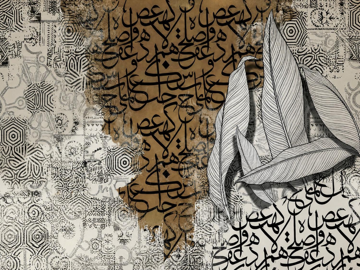
Arabic calligraphy wall printing turns a word, phrase or name written in Arabic script into a large printed feature on a wall. A good project starts with the meaning, then the script and calligrapher, then layout and scale, and ends only after a native Arabic reader has checked a full-size proof for spelling, diacritics and letter joins.
What Is Arabic Calligraphy Wall Printing?
Arabic calligraphy is one of the most respected art forms in the region. In 2021, UNESCO added Arabic calligraphy to its Representative List of the Intangible Cultural Heritage of Humanity, following a joint nomination by a group of Arab countries that included Saudi Arabia. Saudi Arabia's Ministry of Culture had also named 2020 and 2021 the Year of Arabic Calligraphy.
With direct-to-wall printing, that artwork can be reproduced at architectural scale on a majlis wall, a villa entrance, an office reception or a restaurant feature wall. The printer applies the design directly to the prepared surface, so the quality of the final wall depends almost entirely on the quality of the artwork file and the care taken in checking it before printing starts.
That is why Arabic calligraphy wall printing is less about the machine and more about process: choosing the right words, the right script, the right artist and the right approvals.
Start With Meaning: What Should the Wall Say?
Before discussing fonts or colours, agree on the text and what it should communicate. Common choices include:
- Family names or the name of a home, often for entrances and majlis walls.
- Words of welcome or hospitality, such as greetings for guests.
- Lines of poetry or proverbs that reflect the family's or company's values.
- Brand names, slogans or values for offices, showrooms and restaurants.
- Abstract calligraphic compositions where letterforms are used as visual texture rather than readable text.
Write the exact text in a document, confirm the spelling with the person who chose it, and note whether it must be fully readable or can be more artistic. Verses from the Holy Quran and other sacred texts need extra care with placement and respect, and should be discussed separately before any design work begins.
Which Calligraphy Style Suits Your Space?
Different scripts create very different moods. A calligrapher will advise on the best choice, but these broad differences help with early decisions:
- Kufic: Angular, geometric, structured. Often suits: Modern interiors, corporate spaces, geometric patterns.
- Thuluth: Tall, flowing, monumental. Often suits: Large feature walls, entrances, formal majlis.
- Naskh: Clear, balanced, highly legible. Often suits: Text that must be easy to read, longer phrases.
- Diwani: Ornate, rounded, interlaced. Often suits: Decorative names and short phrases.
- Contemporary or freestyle: Expressive, artistic. Often suits: Cafes, creative offices, statement art walls.
Readability is a real trade-off. Highly ornamental scripts can look beautiful but may be hard for guests to read, especially from across a room. If the wall needs to be read quickly, a clearer script or a simpler composition is usually the better choice.
Who Should Create the Calligraphy Artwork?
For the strongest result, commission a calligrapher or an experienced Arabic designer rather than typing the words in a decorative font. Hand-drawn or carefully constructed calligraphy has natural proportions, balanced spacing and correct letter connections that generic fonts often miss.
When briefing the artist, share:
- The final, approved text and its meaning.
- Wall dimensions, photos and any doors, sockets or windows nearby.
- The preferred script or mood, with reference images.
- Colour ideas and the room's materials and finishes.
- Whether the piece must be readable from a distance.
Ask for the final artwork in a format suitable for large-format printing, ideally vector, so lines stay sharp at full size. Our guide to wall printing artwork file requirements explains resolution, formats and colour settings to check before sending files.
How Do You Plan Scale and Placement?
Calligraphy that looks perfect on a screen can feel too small, too crowded or awkwardly cropped on a real wall. Plan placement around how people will see the wall: from the entrance, from seating, or while walking past. Consider eye level, viewing distance, lighting and furniture that might hide part of the design.
In a majlis, for example, calligraphy often sits above the main seating line or on the wall facing the entrance. Our article on majlis wall-printing ideas that combine heritage and hospitality shows how calligraphy can work with the room's layout, while our guide to choosing the right wall for a printed mural covers sightlines and focal points in more detail.
A simple test helps: print a scaled version on paper, or tape the outline of the design on the wall, and look at it from the main viewing positions before final approval.
How Should the Arabic Proof Be Checked?
This is the step that protects the whole project. Errors in Arabic text are noticed immediately by Arabic readers and can be difficult to correct once a wall is printed. Before printing, check a proof at a meaningful scale against this list:
- Spelling: every letter matches the approved text.
- Letter joins: letters connect correctly and no forms are broken or reversed.
- Diacritics and dots: dots, hamza and any tashkeel are present and in the right places.
- Reading direction and order: words flow correctly from right to left.
- Meaning: the composition still reads as intended, without accidental words formed by overlaps.
- Scale and crop: nothing important is cut by edges, corners, switches or frames.
- Colour: contrast against the wall is strong enough for the room's lighting.
Have at least one native Arabic reader who did not create the artwork review the proof, and record the approval in writing with the date and file version. Only the approved version should go to print.
What Mistakes Should You Avoid?
- Relying on machine translation or copying text from images without checking it.
- Using a decorative font for complex calligraphy, which can produce incorrect joins.
- Skipping the full-size check and approving only a small screen preview.
- Ignoring the wall surface, since texture and condition affect fine strokes.
- Treating sacred text like decoration without considering placement and respect.
When you are ready to price the project, our checklist of information to send with a wall-printing quote request helps you share the right details from the start.
Frequently Asked Questions
Can any Arabic calligraphy design be printed on a wall?
Most designs can, as long as the artwork file is high quality and the wall surface is suitable. Very fine strokes need a smooth, well-prepared wall and sharp vector artwork. A site survey and a proof check help confirm that the design, size and surface will work together before printing begins.
Should I use a calligrapher or a calligraphy font?
A calligrapher or experienced Arabic designer usually gives a better result for feature walls, because proportions, spacing and letter connections are built for the specific text. Fonts can work for simple, readable phrases, but complex compositions often need hand adjustment to look natural and correct at large scale.
Who should check the Arabic text before printing?
At least one native Arabic reader who did not design the artwork should check spelling, letter joins, dots and diacritics. The client should also approve the final proof in writing. Independent review catches mistakes the designer may no longer notice after working closely with the piece.
Which calligraphy style is easiest to read?
Naskh is generally the most legible traditional script and is widely used where clarity matters. Thuluth and Kufic can also be readable when the composition is kept simple. Ornate styles such as Diwani are often more decorative, so they suit short names or phrases rather than longer text.
Can calligraphy be combined with other designs on the same wall?
Yes. Calligraphy is often combined with geometric patterns, textures, landscapes or brand elements. The key is hierarchy: decide whether the text or the background is the main focus, keep enough contrast for the words to stand out, and check the combined design as a full-wall proof before approval.
Conclusion
A successful Arabic calligraphy wall begins with meaning and ends with a careful proof. Agree the exact text, choose a script that balances beauty and readability, commission skilled artwork in a print-ready format, plan scale and placement from real viewing positions, and have a native Arabic reader approve the final proof in writing before printing.
Planning a calligraphy feature for your home, majlis or business in Riyadh or Jeddah? Share your wall details and design idea with WallInks and start planning a printed wall that reads as beautifully as it looks.